Celadon
Telereal Trillium, a property developer had purchased a disused building in Poole, Dorset to convert into apartments, hoping to appeal to a younger, style-led audience.
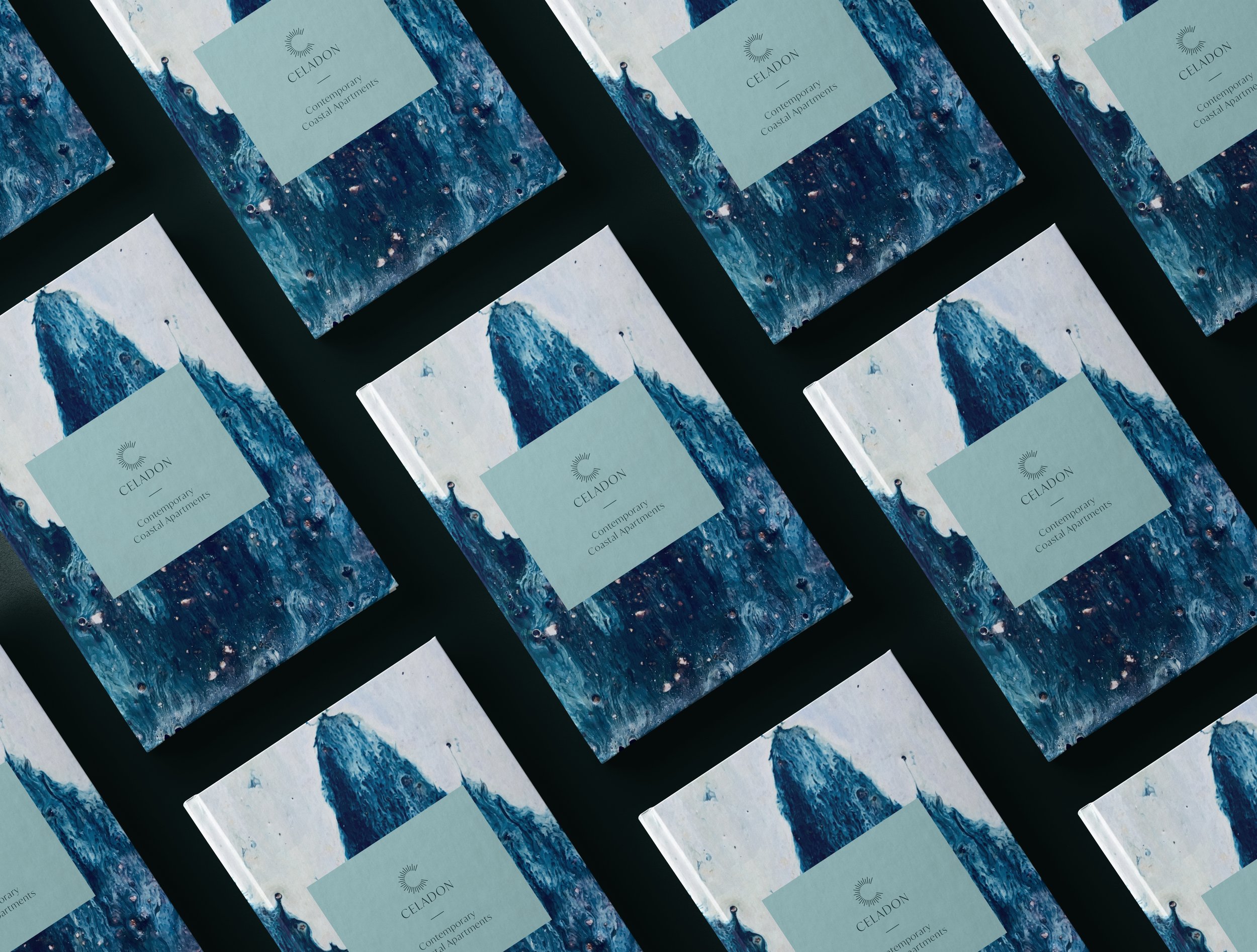
The brief was to create a name and identity to help define the building and give it a story. Poole has an artisanal tradition, particularly in pottery, which would appeal to this new market, valuing authenticity and craft. The visual identity and space leans into and celebrates this local artisanal history by using design cues inspired by this world.

The name Celadon is taken from a hue traditionally associated with pottery, it is a calm, grey-green which is also used as the main brand colour, along with a supporting palette. The colour palette has been chosen because of its soft-luxury feel but also to feel reminiscent of the ocean.
The logo features a modern elegant typeface and also a stylised monogram of the letter ‘C’ made of the sun’s rays - another allusion to coastal living.
In addition to the colour palette, photographic pottery textures are used throughout the visual identity, closely-cropped so they could also be overhead images of the surf crashing onto a beach.